Wednesday, November 4, 2015

Wagart Remake

Wagart Remake


Wagart II
November 2015
Photoshop, color pencil
 
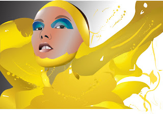
The assignment was to take pick an artwork from a classmate and I picked this one. So far I have been  doing artwork that involves elephants so I added an elephant trunk to the face. I did only one ear because since the original artwork only showed one ear I wanted to keep that. Also my color scheme has mainly been a sort of pink/fuchsia color and blue and decided to change the color using Photoshop.
 

Wednesday, October 28, 2015

Elephant Redo


Elephant Art

Elephant Art Work


Finished


eleBOW
October 2015
Illustrator


With elephants being my main subject matter in my work I wanted to incorporate it into something that you don't see every day. I as I was walking in a clothing store I saw a bow tie and the two ends reminded me of the ears of an elephant. I took that concept and first sketched it out by hand and adding sapphires as the eyes. When making in Illustrator I used the customary colors of a suit and tie attire and then blurring the back to add more emphasis on the bow tie.

Wordphant
October 2015
Illustrator


Going back to the idea of graphic design I wanted to play around with typography. Sticking with the subject of elephant it is obvious that I would use that as the word. But instead of using the whole word for say the head or the body I broke it up by using the letters E, L,E, P, H, and A and the head with P being the center point serving as the elephant's trunk. Then N and T were used to make the body and the tail. I didn't put a background because I felt that if I did it will distract the audience from the main subject, the elephant.


JoE
October 2015
Illustrator

Another object that caught my attention were glasses. The shape of each lens again reminded me of elephant ears. So I based the rest of the drawing around the glasses in the sketch and when illustrating it I decided on the color scheme. I chose the same colors as the previous typography elephant because it's a color that I personally liked and wanted to use it again. This time I didn't want to put a whole lot of emphasis on the object that makes the elephant but rather the elephant itself so I made the ears the same color as the body to blend in while still making the lens a bit transparent so that the glasses concept won't go away. To make it more humorousI decided to give the elephant a pair of glasses as well.


Bulb
November 2015
Illustrator


In Progress


Saturday, October 17, 2015

MADE

Art Work #6


MADE
October 2015
Illustrator
 
Since Graphic Design is my major I wanted to make an artwork that revolved around that. The people in the back are from a Korean pop group called BigBang and they released an album titled "MADE" which will explain why the word is on the front. They also had five horizontal line as their cover logo and I wanted to incorporate it by placing it on their faces with the color of each individual album and the white in the middle for the leader.

Apple

Art Work #5

Apple
October 2015
Illustrator
 
I wanted to practice realism and as well as the gradient mesh tool in Illustrator. I picked an apple because it was something that anyone can draw and seemed like a good object to practice using the gradient mesh tool. It want as complicated as a human and since it has a solid color it was simple enough to do.

Baby

Art Work #4


Baby
October 2015
Illustrator


Wednesday, October 7, 2015

Art Work #3


Blue 
October 2015
Color pencil
 
I wanted to go out of my comfort zone and decide to do an non-digital art work. I first started of by making a random shape which were the eyes and go on from there. I then made the face and the back ground at the end.
Art Work #2


Wednesday, September 23, 2015

First New Artwork
 
First artwork that is not digital this year

Wednesday, September 16, 2015

3 Hour Art


Top 10


Paint
Illustration
2014
Assignment in which we had to use learn how to use the pen tool in Illustrator.


T.O.P.
Illustration
2014
Project that I was working on my free time during class


Bits Bytes & Binary
Illustration
2014
Assignment in creating a book cover for our lesson on binary numbers


CPS Logo
Illustration
2014
Assignment on creating a new logo for CPS as well as being able to use limited colors on logos


Lunch 
Illustration
2014
Assignment on creating a poster that will help keep the school cafeteria a cleaner place


Breakfast
Illustration
2014
Poster of an assignment on advertising free breakfast being offered at our school


Class Shirt
Illustration
2015
Class shirt design for your Digital Media class


Mouse
Illustration
2015
Assignment on crating a flyer with typography and prioritizing information 


fUSE
Illustration
2015
Logo for a and event that was being held in my Digital Media class


Matoki
Blender
2015
Experimenting on a program called "Blender" in making a 3D model. 


Gallery


One of my favorite art work from the gallery was the "Buddhavision" and I liked how it was able to incorporate craft, composition, and concept in the following ways:

Craft- The art work consisted of metal as it's main media as well as an old television screen in the front. It has a Buddha statue on the back and it can not bee seen through the screen unless you are facing the front.

Composition-The work is symmetrical in a way that the Buddha is centered in the back as well as the background. Also it is the only thing that is gold which allows you to focus more on it that anything else in the artwork.

Concept- The screen allows you to see that there are more than one way to look at something and that if you look at it in the right way not only will you see the object but you will be able to see more of the details as well.