Elephant Redo
Wednesday, October 28, 2015
Elephant Art
Elephant Art Work
Finished
eleBOW
October 2015
Illustrator
Wordphant
October 2015
Illustrator
Going back to the idea of graphic design I wanted to play around with typography. Sticking with the subject of elephant it is obvious that I would use that as the word. But instead of using the whole word for say the head or the body I broke it up by using the letters E, L,E, P, H, and A and the head with P being the center point serving as the elephant's trunk. Then N and T were used to make the body and the tail. I didn't put a background because I felt that if I did it will distract the audience from the main subject, the elephant.
JoE
October 2015
Illustrator
Another object that caught my attention were glasses. The shape of each lens again reminded me of elephant ears. So I based the rest of the drawing around the glasses in the sketch and when illustrating it I decided on the color scheme. I chose the same colors as the previous typography elephant because it's a color that I personally liked and wanted to use it again. This time I didn't want to put a whole lot of emphasis on the object that makes the elephant but rather the elephant itself so I made the ears the same color as the body to blend in while still making the lens a bit transparent so that the glasses concept won't go away. To make it more humorousI decided to give the elephant a pair of glasses as well.
Bulb
November 2015
Illustrator
In Progress
Saturday, October 17, 2015
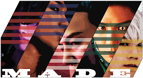
MADE
Art Work #6
MADE
October 2015
Illustrator
Since Graphic Design is my major I wanted to make an artwork that revolved around that. The people in the back are from a Korean pop group called BigBang and they released an album titled "MADE" which will explain why the word is on the front. They also had five horizontal line as their cover logo and I wanted to incorporate it by placing it on their faces with the color of each individual album and the white in the middle for the leader.
Apple
Art Work #5
Apple
October 2015
Illustrator
I wanted to practice realism and as well as the gradient mesh tool in Illustrator. I picked an apple because it was something that anyone can draw and seemed like a good object to practice using the gradient mesh tool. It want as complicated as a human and since it has a solid color it was simple enough to do.


